
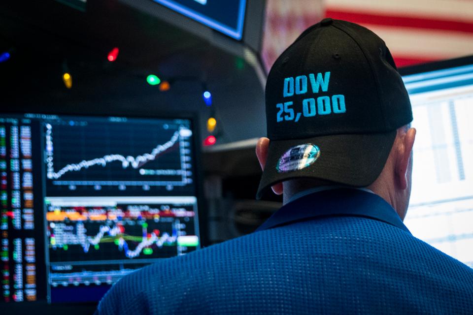
As stocks plunged all week, there seemed to be little concern on Wall Street, as almost all of the experts on financial television felt it would be a buying opportunity. There was a little more concern when the S&P 500 reached its 200-day MA on Friday, but still they were bit turning bearish. Historically, Wall Street strategists have not been bullish at correction lows, but does the technical outlook suggest that they're right this time?
The steep decline in January and February of 2016 had convinced many that the market had started a new bear market. In “Don’t Follow Those Bearish Traders”, I commented that “The high level of bearish sentiment and heavy put buying at the February 11th low coincided with the bullish signals from the market internals.” This created the perfect environment for a market bottom.”
The fact that most on Wall Street did not believe the rally and were looking to sell higher did not alter my outlook, in fact, it was reassuring. There have been a number of sharp corrections in this bull market. These corrections ended when the technical studies gave positive signals, but these signals were often accompanied by dire predictions from most Wall Street analysts.
At most of the correction lows during this bull market, I have been at odds with the high profile analysts. However, does that mean they can’t be correct right now?
When the stock market was strong in 2013 it was still often referred to as “the most hated bull market ever.” This finally changed over the past year as very few have found anything wrong with the stock market until last week.
Even after the powerful market decline, the leading Wall Street strategists have not changed their bullish outlook. In fact, only one has lowered their year-end S&P 500 forecast, from 3000 to 2909. I was concerned in December that many were getting too bullish, as they had all been too bearish on stocks for the year.
During the past corrections, there was always plenty to worry about, but by the end of 2017, the wall of worry was almost nonexistent. Therefore, those who look at the market from a fundamental standpoint have trouble turning bearish right now, since the only fundamental concern is rising rates, while earnings and the economy are strong.


While rates are increasing, the charts suggest that the yields may have trouble rising rapidly from here.
The long-term chart of the 10 Year T-Note Yield shows that there is next chart resistance at 3.019% (line b) with the major downtrend (line a) at 3.225%. A move above the much-watched 3.000% level could cause a break of the downtrend, but there is still considerable resistance in the 3.30-3.50% area that will be hard to surpass. The chart I featured last week also illustrated that stocks can move higher with rates.
The speed of last week's decline may have been enough to spook some strategists, as most completed corrections in a bull market have taken time. The worst correction in 2011 dropped the S&P 500 by 19.4%, but it took 157 days. The 16% correction in 2010 lasted 70 days.
In fact looking at the historical record of the corrections over the past eighty years it is rare to have a completed correction where the S&P dropped more than 10% in under 30 days. In late 2011, there was a decline of 9.8%, but it took 28 days, while the 12.4% decline in 2015 lasted 96 days.
There are a few exceptions: the 10.8% correction in late 1997 only lasted 20 days and the 13.9% drop in 1973 that lasted 29 days. There was a nasty correction in 1955 as the S&P lost 10.6% in 18 days. Way back in 1936 there was a 23-day decline where the S&P 500 lost 12.8%.
But the point here is that while rapid corrections are rare, they do happen, and can be understood by looking at similar examples from the past.


There have been sharp drops as part of the larger corrections that do match the speed of the recent decline. From December 29, 2015, high to the low on January 20th the S&P 500 lost 12.9% in fourteen days. Also from August 17th to August 24th of 2015, the S&P lost 11.2% in just six days.


In both of these instances, the major A/D lines were declining as were their WMAs. The chart of the Spyder Trust (SPY) during the period in late 2015 shows that the S&P 500 A/D line broke support (line b) in early December as it was in a confirmed downtrend. The rally at the end of the month just took the A/D line back to its downtrend (line a) before it dropped sharply.


This was not the case with the recent decline, as from the January 26th high of $286.63 to Friday’s low at $252.92, the SPY was down 11.7% in just 10 days. The S&P 500 A/D line peaked with prices and was in a strong correction. It dropped strongly below its WMA last week before it turned up slightly on Friday. It is well below its WMA but above the stronger support (line a).
The fact that the S&P 500 has cut through so many levels of support has many technicians concerned, with a few are now proclaiming that we are in a bear market. Should they be concerned? It was a surprise that the market found very little support in the 2650-2700 area, as it just kept dropping.
The fact that the S&P 500 tested its 200-day MA at 2939 on Friday was also surprising, but the fact that the moving average was rising made the action less bearish. From the low of 2532, the S&P 500 rallied nicely to close at 2619.


What are the next key levels of support? There is next important support at 2508 (line a) which was the September 2017 high while the July high (line b) is at 2483. The 38.2% Fibonacci support from the 2016 low stands at 2466 and there is additional support at 2416 (line c). A drop below 2500 could be enough to change some of the Wall Street forecasts but I would expect the 2460-80 area to hold.
Even though the major averages like the S&P 500 rallied over 3% from Friday’s low, all the major averages dropped over 5% for the week. The weekly A/D numbers were almost 5-1 negative with 791 NYSE stocks making new lows. Only 60 stocks made new highs.
Despite the very weak A/D numbers, the weekly A/D lines for the S&P 500, Nasdaq 100 and Dow Industrial are still above their rising WMA. This is consistent with a correction, not the start of a bear market or more severe correction.


The NYSE Composite had a low of 12,048 on Friday. This was just above the early August high at 12,019 (line a). The uptrend from the May-August lows (line b) was slightly broken on Friday’s session.
The daily NYSE A/D line dropped below its WMA last Tuesday, and slightly broke the yearlong support (line c) on Thursday. It turned up slightly on Friday. The fact that the A/D numbers closed positive after being 2-1 negative on Friday is a good sign.
The next good A/D line support is at the November lows (dashed line). The weekly NYSE A/D line (not shown) has dropped below its WMA and has reached the support from 2017.

The PowerShares QQQ Trust (QQQ) closed up 4% from Friday’s low at $150.12. At that low, it had been down 12.2% from its high at $170.95. The long tail on the weekly chart suggests that there was real buying at Friday’s low. It held above the major support at $145.92 (line a). The 38.2% support from the 2016 low stands at $141.13. There is next resistance for the QQQ at $158-$160 and a strong close above the declining 20-day EMA at $162.70 would be a sign that the worst of the selling was over.
The weekly Nasdaq 100 A/D line has turned down sharply from its recent high but is still above its rising WMA. It is well above the support from the 2016 low (line b). The daily Nasdaq 100 A/D line (not shown) has turned up from its support but it would take several days of very strong A/D numbers to move it back above its WMA.
So what it the most likely market scenario?
A V-shaped bottom occurs when the market has a sharp drop and then turns higher just as sharply. They are quite rare, and though I do not expect one now, the fact that no one is looking for one to form means it should be considered as a possible scenario.


There was a V-Shaped bottom in the PowerShares QQQ Trust in October 2014. The panic low on October 15th marked the end of a 10.2% drop from the new high in September. CNN referred to it as a “market ‘freak out” as the Dow dropped 460 points before it rebounded.
I was speaking at a conference at the time as there were fears over the spread of the Ebola virus and one doctor-turned-market analyst was among the crowd that expected a bear market. The sharp decline was later attributed to the fact that several hedge funds were on the wrong side of both crude oil and bonds.
The Nasdaq 100 A/D line did come close to long-term support (line b) on the decline. A few days after the low, the A/D line overcame its downtrend (line a), and 12 days later the QQQ made a new high.
Many things are different now than they were in 2014, and the A/D lines have dropped more sharply lately than they did in 2014. If there is going to be a V-shaped bottom, we should see a rapid rebound early this week with a strong close on Friday.
The more likely alternative, however, is for a more complex correction, where the averages rebound enough to calm the markets, and then we get one more drop before the bottom is complete and the uptrend resumes.


What to do? Many of the ETFs that performed the best last year, like the Technology Sector Select (XLK), violated their near-term support (line a) early last week. This caused some to get out as they felt the trend had changed.
XLK did drop further, but I think the support from last summer’s highs (line b) is more important for the long-term trend. The daily relative performance has held up well during the decline and the OBV does not show any heavy selling pressure. This ETF, as well as the Consumer Discretionary Sector Select (XLY), are just two ETFs I am looking to buy. There are likely to be some good buying opportunities from my Viper Global ETF list. As I stressed before the market plunge (“Don’t let The Euphoria Change Your Plan”), the risk needs to be considered for all new positions.
Now that many companies have reported earnings, there are likely to be a number of stocks that are looking more attractive after a 10-20% decline. In my scan for next week’s Viper Hot Stocks Report, there were no new weekly buy signals but there were several daily buy signals on Friday.
Both the Viper ETF and Viper Hot Stocks reports are sent out twice a week. They include in-depth market commentary including the A/D line analysis and specific recommendations. Each report is only $34.95 per month.
Comments
comments