

The bull market since 2009 has been characterized by many different phases of sector rotation as some sector ETFs have done much better that the Spyder Trust (SPY) while others have done much worse. In 2010 the Energy Sector Select (XLE) was up 21.8% while the SPY gained over 15%. Both did much better than the Utility Sector Select (XLU) as it was up only 5%.
The next year was much different as the XLU was up 19.6% while the SPY gained just 1.9%. The XLE did just a bit better than SPY as it was up 2.8%. The market leading sectors provide the best trading opportunities as swing trading setups have a higher probability of turning out successfully.
(Side Note: You might also like: The 20 Habits of Wealthy Traders)
So how can traders or investors find the strongest sectors and avoid those that are acting weaker than the overall market?
Over the past twenty years I have applied my unique relative performance (RS) analysis to find the best sectors. This methodology has provided me with the key insight to determine which sectors to buy and also identifying those to avoid or to sell short.
My RS analysis incorporates multi-time frames using both pattern and moving average analysis.
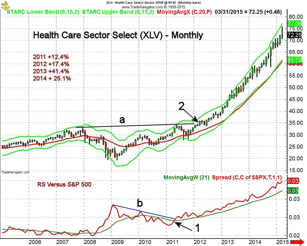
The Health Care Sector Select (XLV) staged a multi-year breakout in 2012 (point 2) as it overcame the resistance at line a. An examination of the long term charts of the S&P Health Care Index also revealed that it had overcome 12 year resistance in 2012. As the performance data on the chart indicates, XLV has been a star performer since 2011.
Below the bar chart of XLV is the RS line in red with a weighted moving average (WMA) in green. The RS line moved back above its WMA at the end of April 2011, point 1, indicating that XLV had again become a market leading sector. This signal corresponded with a monthly close at $32.85 and by the time XLV had overcome the key chart resistance at $35.80 it was already 9% higher.
The RS line has since stayed well above its WMA and the WMA has been rising steadily since early 2012. In spite of the sharp drop in August 2015 the monthly RS line is still above its rising WMA.
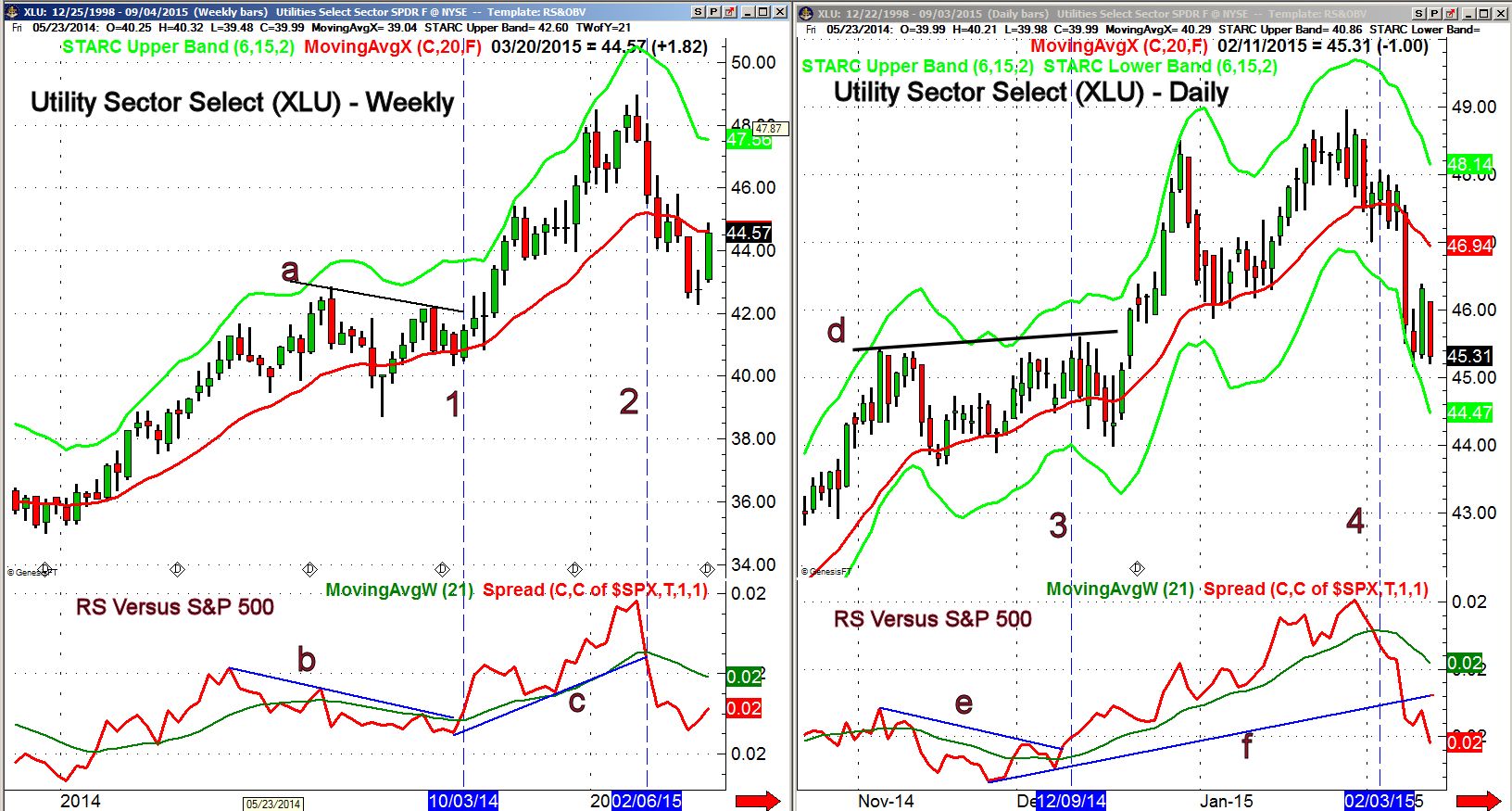
The monthly RS analysis is the key in determining the major trend and also can be very helpful in determining the allocation in your 401K allocation or IRA. The weekly RS analysis however is the key for all traders and is also helpful to many investors. The RS analysis of the Energy Sector Select (XLE) clearly demonstrates why it is dangerous to take a buy and hold approach with any sector ETF.
On March 21, 2014 the weekly RS line for XLE moved above its WMA (line 1) as it closed at $84.54. Over the next fourteen weeks XLE rallied to a high of $97.58. This was a gain of 15.4% or over 1% per week. By the end of June XLE had reached its weekly starc+ band which signaled that it was time to take profits.
On August 1st the RS dropped below its WMA (line 2) . Over the next two weeks as XLE moved higher the RS line kept falling. This was a sign of weakness as the RS line dropped further below its declining WMA. The week of September 12th XLE closed below the prior six week lows. In the last quarter XLE has dropped over 11%.
In January 2015, XLE made a low in January and then traced out a flag or continuation pattern, lines a and b. The weekly RS line made lower lows in March, line d, before it rallied above its WMA in April. The lower lows in the RS line suggested that an important low was not yet in place.
Just two weeks after XLE made its rebound high at $83.11 the RS line dropped back below its WMA. Five weeks later the support for XLE, line b, was broken confirming the RS analysis that the downtrend had resumed. In August the XLE plunged below its weekly starc- band as it is down well over 15% in the past three months.
Comments
comments