
Most stock investors spend a large amount of time using technical or fundamental analysis to pick the best stock, ETF or fund to buy. Less time is spent on doing equally rigorous analysis of the market’s trend and too often their stock market decisions are based on a fundamental opinion of the economy. The majority of technical analysts of course will tell you that the fundamental data badly lags the price action.
In March of 2009 it was almost impossible to have a positive fundamental view of the economy. As I will show you later there were clear technical signs at the time that the stock market was indeed bottoming. In this article I will focus on the one indicator that is often ignored by many but that should be followed closely by all stock investors.
While there are always some stocks that will rise when the major averages are declining, going against the major trend is generally never a good idea. By determining the market’s internal strength or weakness you will be able to make a more reasoned decision whether to buy or sell and this should make your investing more successful. Don’t Miss This Chance To Build Your Investing Future
The best way to measure the market’s health is through the advance/decline line or A/D line. The most important A/D line is based on the NYSE Composite. It is calculated daily by determining the number of stocks that are up (advancing) and also the number of stocks that are down (decliners). The A/D line is a then cumulative total of the number of advancing minus the number of declining stocks. In many years of educating investors and traders I have found that many do not understand the analysis of the A/D line. (Learn about the A/D line with Tom's Special Course)
In many years of study I have found that the A/D line is the most effective in a bull market when identifying in the end of stock market corrections. In this article I will show you how I use support, resistance, trend line analysis and moving averages to determine the market’s trend using the A/D Line.
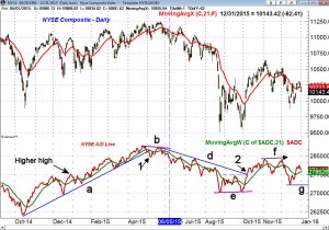
Whether you are a professional hedge fund manager or a 401K investor, 2016 was a tough year. As I explain below the NYSE AD line stayed positive until early May when it showed signs of weakness and then turned negative by early June. It stayed in the corrective mode until early October. Despite the weakness late in the year the fall's positive signs from the A/D line in October have not yet been reversed.
The NYSE A/D line (click on any image to enlarge) was in an uptrend at the end of 2015 and the new high on December 29th reaffirmed the positive trend. The A/D line made another new high at the end of January which was the start of a strong rally that lasted until early March. When the A/D line is rising sharply it is an environment where stock traders should be doing aggressive buying.
The A/D line again surged in April making a convincing new high on April 29th. The eight day decline from these highs was accompanied by weak advance/decline numbers as the A/D line dropped below the April low, point 1. The longer term support in the A/D line from the October 2014 lows, line a, was therefore broken.
As the NYSE composite made a new closing high on May 21st the A/D line formed a lower high. This negative divergence, line b, was a sign of weakness as fewer stocks had pushed the market to a new high. This bearish divergence was confirmed on June 5th (see line) when the A/D line dropped below its previous low.
The A/D line continued to deteriorate for the rest of the month as the global markets became concerned that Greece might leave the Euro zone. As I noted in "Greece Isn't The Real Problem" on July 4th the deterioration in the stock market was the real problem. The A/D line after the negative divergence had formed a new downtrend, line d.
The A/D line formed a convincing new low on August 25th and then after a rally into the middle of September it turned lower once more. When the NYSE Composite made a new low on September 28th the A/D line formed a higher low, line e. The bullish divergence was confirmed on October 7th as the A/D line moved both through its downtrend (line d) and above key resistance, point 2.
The A/D line made a higher high in both early November and December, line f, before correcting sharply. As of the close on December 31st the A/D line is still above its WMA and it will now take a drop below the recent low, line g, to start a new downtrend. This makes the action as we start the new year quite important.
Of course these patterns are rarely exactly the same but through these examples on analyzing the A/D line should help you be well prepared for most any future market scenarios.
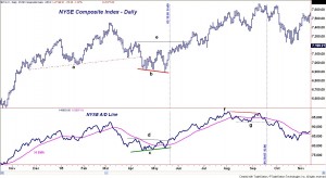
This chart from Tradestation.com covers the period from November 2004 through November of 2005 and is a ideal example of how the A/D line can identify a market low. On the bottom of the chart in blue is the A/D line with an EMA of the A/D line in pink.
From the NYSE Composite’s March high of 7453 the market retreated sharply and violated four month support, line a, in April. This created significant overhead resistance as anyone who bought since November was now at a loss.
The NYSE made lower lows in April and May (line b) consistent with a weak market. The NYSE A/D line was giving a different picture as it formed higher lows, line c. A bullish or positive divergence is not always seen at market lows but when it is it is highly reliable.
As I have mentioned in prior articles "Analyzing RSI Divergences" once a divergence is spotted I wait for it to be confirmed before I am confident that a turning point has been identified. On May 15, 2005 (line 1) the A/D line moved above the key resistance at line d, which confirmed the positive divergence.
It is important to note that the A/D line was acting stronger than prices as while the NYSE was at 7124 and was still well below the April high at 7222 (line e), the A/D line was higher. The NYSE Composite did not overcome its resistance until 17 trading days after the A/D line.
Though this may seem rather surprising this is a rather common occurrence with the A/D line. Over the next three months the A/D was rising steadily but on August 12th it failed to make a new high with prices (point 2). This was a warning sign for ETF, stock and mutual fund investors.
The NYSE Composite made a further new highs on September 9th at 7665 (point 3) but the A/D line failed to make new highs, forming a negative divergence, line f. This divergence was completed on September 20th when support at line g was broken. This was eleven days before the important chart support at line h was also broken.
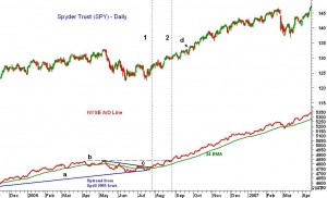
With the popularity and liquidity of ETFs like the Spyder Trust (SPY) I started to combine it with the NYSE A/D line and found the signals to be quite reliable. The SPY peaked in May 2006 which made the followers of “Sell in May” happy for a while.
The ensuing decline in the SPY took it 7.5% lower as it bottomed at $122.34 on June 14th but the NYSE A/D line only declined by 2.4%. This was a sign that the market was showing internal strength. The A/D line tested long term support at line a, but no divergences were formed. On July 26th the SPY closed at $126.83 and the downtrend in the A/D line was broken (line 1).
By early August the A/D line was well above its rising WMA and on August 29th (line 2) the A/D moved above the May highs with the SPY closing at $130.58. It was almost a month later before the SPY surpassed its May highs.
The A/D line remained very positive until February of 2007 when a negative news on the Chinese market caused a sharp sell off in the US. This took the A/D line below its WMA for the first time since July. The A/D line did hold up better than prices and formed a slight positive divergence before turning higher.
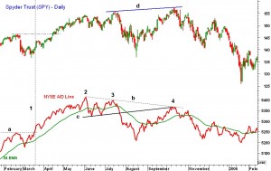
The market high in 2007 was textbook example of A/D line analysis. After the February drop (Figure 2) the A/D line rebounded sharply and by March 20th (line 1) it had already moved above the previous high, line a. The A/D line was again leading prices higher as the sharp rally continued into early June where the A/D line made its bull market high at point 2.
The A/D line developed support in June and July, line c, but when SPY made a new high on July 17th the A/D line failed to make a new high (point 3). This bearish divergence is illustrated by line b. The A/D line dropped sharply into the August lows and moved well below its WMA. (The wide gap between the A/D line and its WMA indicated an oversold market)
By early September the A/D line was again in an uptrend (higher highs and higher lows) On October 11th, 2007 SPY hit a high of $157.52 but the A/D line was much lower (point 4). The A/D line had just rallied back to its downtrend, line b, and the former support, now resistance at line c.
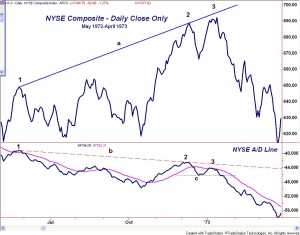
Just to illustrate that this type of A/D line analysis has worked for many years , this chart covers the NSYE Composite from May 1972 through April 1973. This is the market top that was followed by the massive bear market of 1973-1974. Prior to our recent financial crisis was the worst bear market since the depression. (Though I was not trading the market at the time by the late 1970’s I had studied this period in detail using historical charts and data)
The NYSE A/D line peaked on May 26, 1972 with the close in the NYSE Composite at 648.66. The market stayed in a broad range until the latter part of October as the A/D line was forming lower lows. The A/D line moved above its WMA on October 26th and the NYSE Composite rallied over 11% by early December, point 2. On this high the A/D line was much lower, line b.
The NYSE Composite then another new high on January 11th but the A/D line was not able to move above its declining WMA and formed a much lower high, point 3. This second bearish divergence signaled that the market was internally weak. The drop below the A/D line support, line c, just two weeks later completed the top. By the final low in October 1974, the NYSE Composite had lost over 50% of its value.
As for more recent history the market bottom in March 2009 came at a time when many investors had already given up on the stock market. The selling into the November 2008 lows took the stock market as well as the A/D line to dramatic new lows. Stocks finally rebounded into early 2009 and stabilized before another wave of selling hit in February 2009.
As the major averages headed back to test their lows the market internals had improved as the A/D line started to act stronger. This was evident in a chart of the NYSE Composite that was posted on February 25th, 2009.
If the market was actually bottoming then finding the strongest sector was obviously quite important. After running my relative performance or RS analysis on the key sectors there was one sector that stood out as I noted on March 4th in “Tech Sector Breaks Out”.
(The relative performance analysis of the QQQ was discussed in detail in Part 2 of my three part series on RS analysis which can be found here on You Tube.)
The positive view of the RS analysis was consistent with the analysis of Tradestation’s advance/decline data on difference market averages which includes the S&P 500, Dow Industrials, Amex Index, Russell 2000 and the Nasdaq 100.
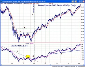
In this chart I have plotted the Nasdaq 100 tracking ETF PowerShares QQQ Trust (QQQ) versus the Nasdaq 100 A/D line. The A/D line made sharp new lows in November as did QQQ before it rebounded back to the $31.63 level in both December and January (line d). The March 9th lows in QQQ at $25.63 were just above the November 2008 lows at $25.06.
Though it is tough to tell on the chart the Nasdaq 100 A/D did make slightly lower lows in March. It had tested its downtrend (line c) from the June 2008 highs in February (see circle) but failed to move through it. The A/D line rose sharply from the lows and did break its downtrend on March 23rd
By early April (line 1) the A/D line was in a new uptrend as tests of its WMA were well supported. Further resistance for QQQ at $33.85 was overcome by the end of April which was confirmed by the A/D line. Both QQQ and the A/D line formed corrective flag patterns in July, before both again moved sharply higher. The A/D line stayed positive and held support (line e) as QQQ had moved above the $50 level by April 2010.
This chart of the Spyder Trust (SPY) and the S&P 500 A/D line covers the stock market lows in the summer of 2010. It provides a good example of what to look for when thee are no clear positive divergences. Both the A/D line and the SPY made new lows in early July then rebounded back to the resistance from June, lines a and c. It is important to note that both were unable to move above their June 21st highs.
This high in the A/D line allowed one to draw a downtrend, line b, which gave us two levels of resistance in the A/D line to watch. The S&P 500 A/D line overcame its resistance on September 10th (line 1) while the NYSE A/D line was even stronger as it moved to new highs a few days earlier Advance-Decline-Line-Hits-New-High" September 8th.
The October lows in the A/D line became a good area of support and allowed one to draw and uptrend, line d. This uptrend held even on the sharp market decline in March of 2011 that was in reaction to the nuclear disaster in Japan.
More active traders often watch the number of advancing and decline issues during the market day in an effort to assess the market’s short term heath. Often times you will see a market that is only up slightly going into the last two hours of trading but there are 3 or 4 times more advancing issues than declining ones. Often times this will results in a strong surge at the end of the day
The reverse of this is also true as sometimes you will see a market that is just up or down slightly but there are more declining issues than advancing issues. This is a sign of internal weakness makes a late day sell off much more likely.
For most investors keeping track of the daily advance/decline data is probably not necessary. However, I would strongly encourage that you to look at the A/D line each weekend as that is often the best time for objective analysis. It can be helpful to print out a hard copy of the A/D line as by manually drawing trend lines as well as support or resistance levels you may be forced to focus more closely on the stock market's trend.
Stock traders might take a look at Tom's Viper Hot Stocks report which is updated twice a week with specific signals on the Nasdaq 100 and IBD top 50 stocks.
If you would like to become an expert in using the advance/decline line to improve your investing and trading results Tom does provide one on one instruction. If you are interested in learning from one of the leading experts in market breadth you can also email Tom at WentworthResearch@gmail.com for more information.



24 thoughts on “One Indicator Stock Traders Must Follow”
Comments are closed.