In 1982, I started working as a technical analyst of the financial markets, leaving behind a career as a biochemist. One of the earliest technical tools I found was the Moving Average Convergence/Divergence (MACD), which was created by Gerald Appel in 1979. It was not readily available to most traders at the time, but I had access to CompuTrac, which was one of the few pieces of technical analysis software in existence.
I was able to meet Gerry in 1983, when we were both speaking at a Technical Analysis Group Conference. When I informed him that the MACD signals on weekly currency data were quite impressive, he seemed pleasantly surprised: he had already moved on to other methods of analysis. Unfortunately, Gerry passed away in February 2020, but I have fond memories and traveling around Asia with him and his late wife Judith.
As a tribute to one of the pioneers of technical analysis, let’s take an in-depth look at the indicator Gerry created. To many, the two lines that make up MACD suggest that a complex algorithm is involved. The two lines are referred to as the MACD and the signal line. The MACD is calculated by simply subtracting a 26-period exponential moving average (EMA) of the closing prices from a 12-period EMA. The signal line is a nine-period exponential moving average of the MACD.
In a strongly trending market, the faster 12-period EMA will be rising or falling more sharply than the 26-period EMA, making the MACD positive and rising. Conversely, when prices are range-bound, the difference between the two EMA's will also oscillate within a range.
Therefore, the MACD is essentially a momentum oscillator that is derived from multiple moving averages. The most basic interpretation is to buy when the MACD line crosses above the signal line and sell when it drops below it.
For those doing mutual fund switching, the monthly analysis will catch the major trends, but it is the weekly analysis that I find to be most valuable.
As I worked more with the MACD, I began to focus on a way to anticipate the crossovers. I looked at several different approaches, and in a 1984 conference, I first presented charts that represented the spread between the MACD and signal lines. Two years later, I started calling this indicator the MACD-Histogram, or MACD-His.
I had observed that when the MACD line was above the signal line and the spread was widening, it indicated a strong up-trending market. But as the trend lost its momentum, the spread narrowed. My analysis indicated that by identifying divergences between the MACD-His and price action, reliable signals were generated ahead of those from the MACD and signal line crossings.

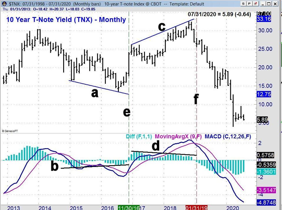
In my most recent Forbes.com article, I featured a monthly chart of the 10 Year T-Note yield that clearly illustrates the advantages of using the MACD-His to give advance warning of MACD and signal line crossings.
Yields had declined from the high in early 2014 of 3.034% to an early 2015 low of 1.651%. After a rebound into June of 2015, yields started to decline once more and had a July 2016 low of 1.336%.
During the 2015 rebound, the MACD moved above the signal line for two months before turning lower. The lower low in yields (line a) was accompanied by higher lows in the MACD-His (line b). The MACD-His rose for two months before the MACD moved above its signal line (line e).
The rally in yields lasted until October 2018, but the MACD-His peaked in February 2017 and then formed lower highs in early 2018 (line d), even though yields rates were still moving higher (line c). The MACD-His turned negative in January 2019 (line f) as the MACD and signal line crossed.
Both have remained negative since, as the MACD-His, MACD, and signal line have all made lower lows.

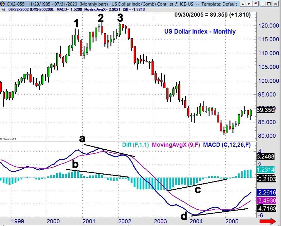
The Dollar Index futures made higher highs in late 2000 and in 2001 (points 1, 2 and 3). The monthly MACD and MACD-His turned positive in January of 2000. The MACD-His peaked in October and then formed a lower high in June 2001 (line b). This was in contrast to the MACD and signal lines, which peaked in June.
As the dollar index futures were making their high in January 2002, the MACD formed a lower high (line a). As the MACD was forming a lower high the MACD-His stayed negative, remaining below the zero line.
From the January 2002 high of 120.80, the Dollar Index futures declined until December 2004, when it had a low of 80.48. The MACD-His bottomed in May 2003 and then formed higher lows in December and in late 2004 (line c). In contrast, the MACD did not bottom until early 2004 and then formed higher lows (line d). These bullish divergences indicated that the Dollar Index was bottoming, with the MACD-His showing that trend change even earlier than the MACD.
Of course, the monthly MACD as well as the MACD-His signals often do a fairly good job on a number of markets without using divergence analysis. The signals are often not as clean when using weekly or daily data, as there are more frequent, less clear signals.

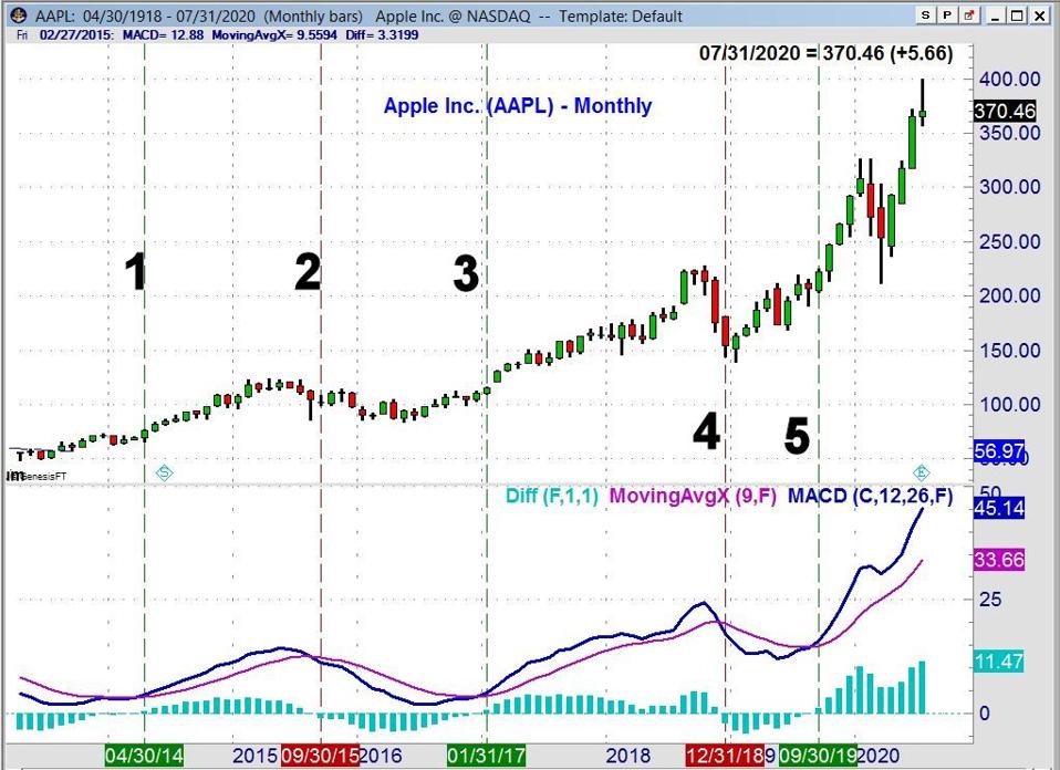
Let's look at Apple AAPL +2.7%'s (AAPL) monthly charts going back to 2014. The MACDs started to bottom in early 2014 and then both turned positive (along with the MACD-His) in April (line 1) as AAPL opened in May at $76.17. That signal was not reversed until September 2015 at $100.97 (line 2). The MACDs did not turn positive again until January 2017 (line 3), with an entry at $120.73.
In December 2018, the positive or buy signal was reversed and AAPL opened the next month at $151.82 (line 4). The most recent signal was a new buy in September 2019, as AAPL opened the next month at $223.26. On July 24, 2020, AAPL closed at $370.46, with the September 2019 buy signal still intact.
From these examples, it should be clear that I find the MACD and the MACD-His to be most valuable when used on monthly data. They can often give you a very clear reading on the intermediate or long-term trends. By using the MACD-His, you can look for divergences to give early warnings of a change in the trend.

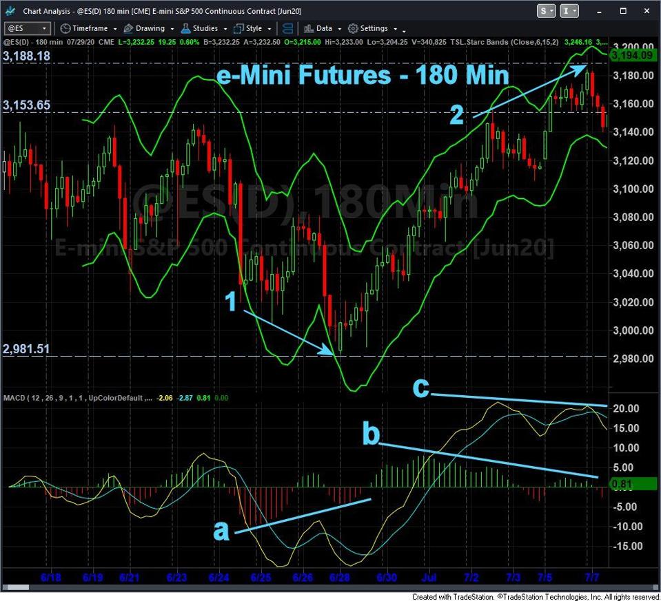
Using the MACD and the MACD-His can be useful on the daily or intraday data, but it is important to have a view of the more dominant trend from longer term data. As we moved into June 2020 the daily trend in the e-Mini S&P 500 futures was positive.
Early on June 24, the MACDs turned negative and stayed that way until late on June 26. As the futures made a new correction low late on June 28 (see arrow 1), the MACD-His formed a significantly higher low (line a) and then turned positive before the end of the day. The signal line (in yellow) did not make a new low with prices but the MACD (blue line) did form lower lows, so there was no divergence from prices.
The MACD-His started to diverge from prices on July 2 and then crossed below the zero line on July 3, turning negative. After the long weekend, the MACD-His turned back to positive, but even though the e-Mini S&P futures made a significant new high (see arrow 2), the MACD-His formed a lower high and a bearish divergence (line b). The signal line also formed lower highs on July 7 (line c). As you can see, the MACD and MACD-His once again gave signals before the correction.
MACD and MACD-His are my preferred tools when volume data is not available. In my experience, multiple divergences are often formed by the MACD-His, but once an initial divergence is formed, one should be on the alert for a trend change. That trend change could be confirmed by price action. If volume data is available as well, a trend change can also be confirmed by a divergence in volume. With this kind of predictive power, the MACD and MACD-His are indicators that belong in every trader's toolbox.
If you like this type of market analysis, you might consider the Viper Hot Stocks Report or the Viper ETF Report. I update subscribers with market analysis twice per week, along with specific buy and sell advice. Each report is just $34.95 per month. New subscribers also receive six free trading lessons, a $49 value.
Watch Tom's videos now on You Tube or email Tom at Tom@viperreport.com


